Tazo Tea
Brand Strategy
Packaging Design
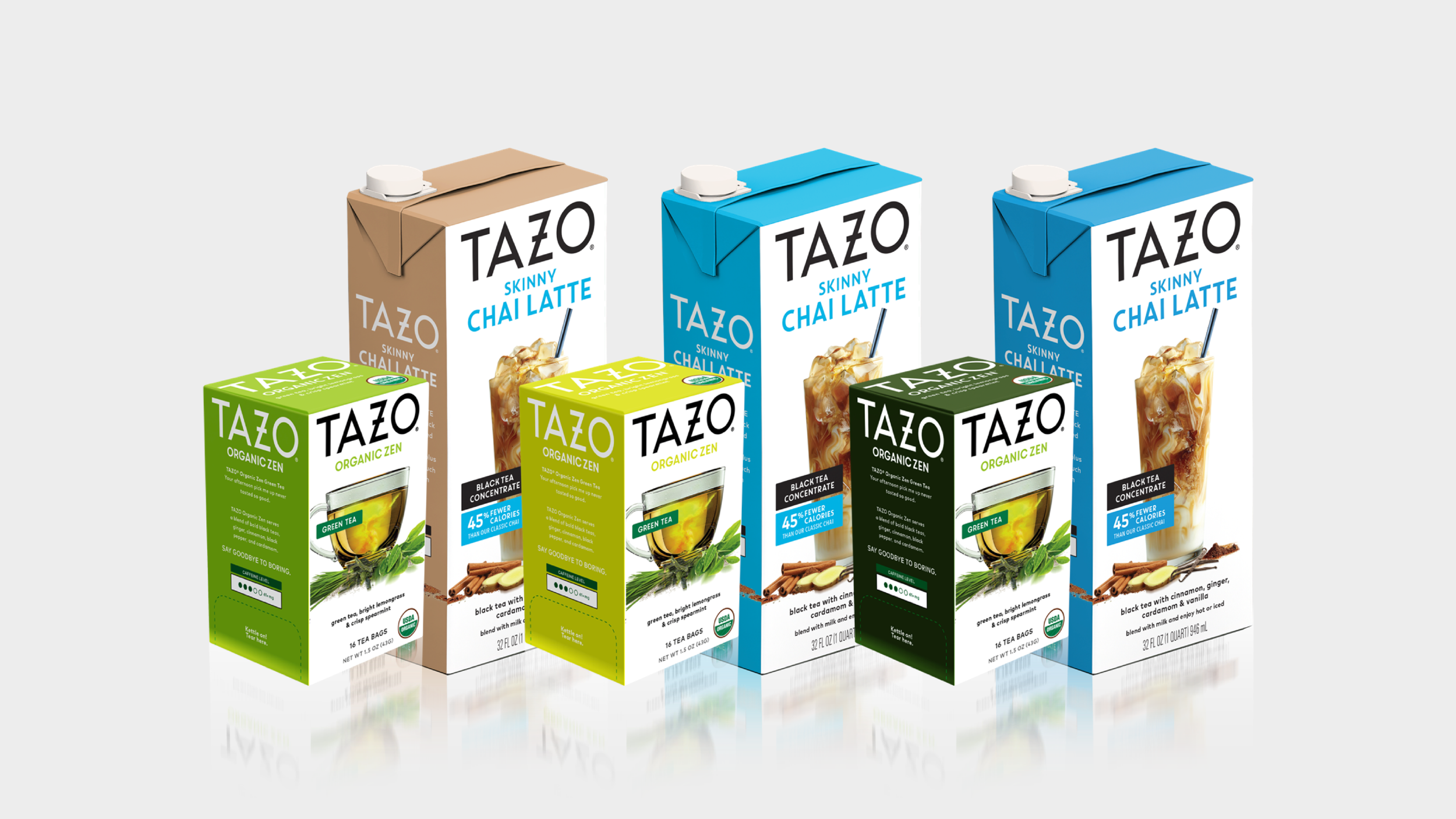
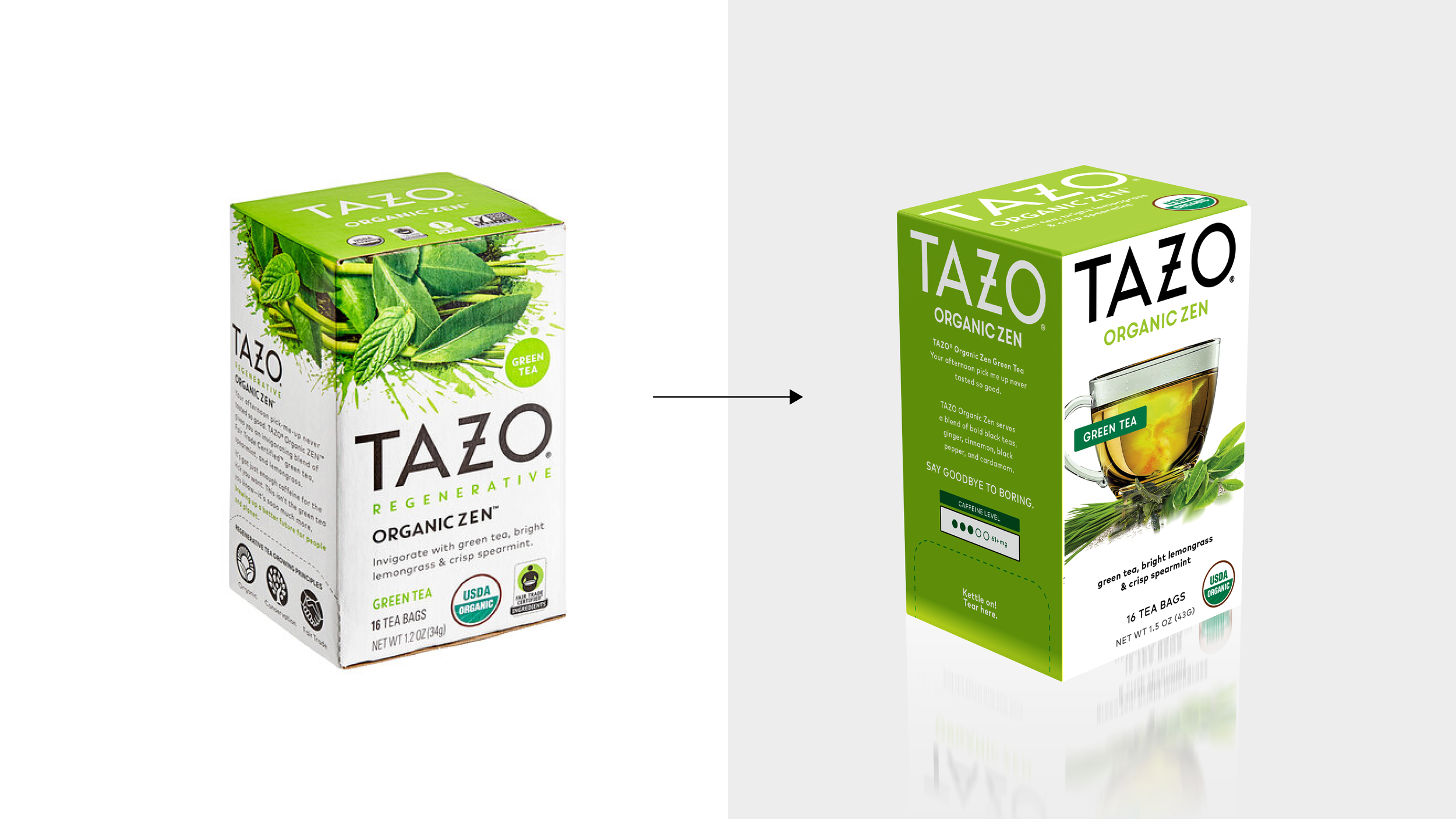
Tazo was looking to modernize its tea packaging to remain visually relevant in a competitive market. I collaborated with another designer to create a cohesive, streamlined look for both their loose tea sachets and concentrated tea liquids. With so many tea brands competing for attention on the shelf, our focus was on reinforcing Tazo’s iconic black and white branding while using bold, energetic color accents to differentiate flavors and enhance shelf presence.
An important part of our process was thoughtfully selecting the appropriate tea glass to represent each flavor. Just like in the alcohol industry, tea drinkers are highly particular about the vessels they associate with quality and experience. Every detail—down to the glassware—played a role in creating packaging that felt both authentic and elevated.